Hierarchy Project
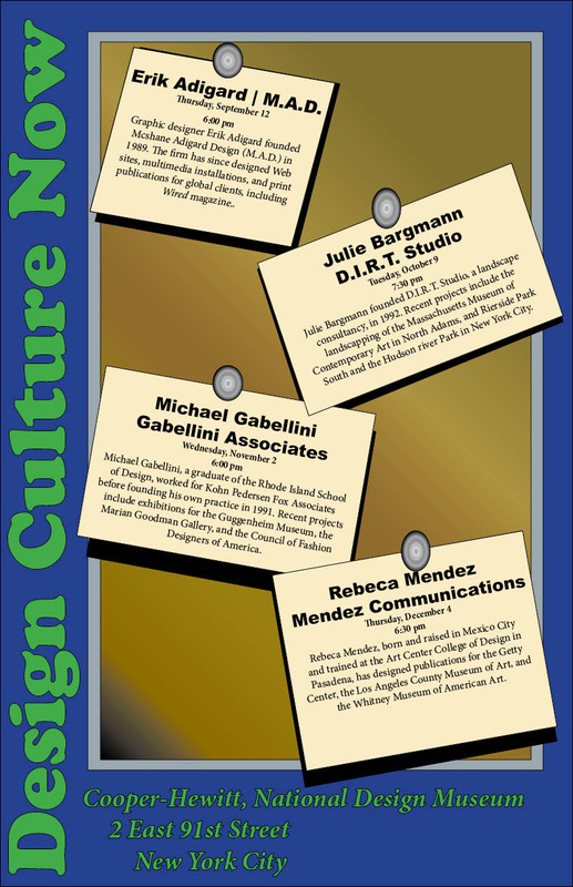
The project was to create sort of a poster for a company with upcoming event, but to make it stand out and connect to people, and make it more intertwining then what you normally see and Not like a interoffice memo. So the idea I had was to make it sort of a bulletin, but one you would see at college with thing held by thumb tacks. so I put the information required into some small slanted boxes and made them look like sticky notes, and with some text promoted the idea sideways on the poster with the location/information at the bottom, resulting to the first draft image.
| charles_t2-1d_.pdf |
After some great feedback, I added the thumbtacks to the notes and corrected some of the grammar issue pointed out, the text was also change around to better server the poster, and some of the color was messed with to stand out better, mainly the bulletin board as to give it more of the texture feel to it.
| charles_t2-2d_.pdf |
The last thing to do to it was make the words not hit the sides of the sticky notes, after some messing around with the paragraphic settings, the word were in a better position to be read and seen. I also took 2-3 of the thumbtacks and slated them a bit to give sort-of a 3D feel to them. After all that I got the final result of the project.
| charles_t2fianl_.pdf |
Artist's Statement
The project was to create a poster board promoting events that wouldn't make it look like an office memo. The goal for me on this project was to make the events look like sticky note on a bulletin board to give more of a feel to the image, I see that after looking at the finish work That their are some small errors such as a shadow. The overall process to get the final image was not really hard as the reviews I received from other pointed very few flaws in the work, and what was suggested to improve were easy to do. The final thought on this work is it dose it job of promoting the events, but also give's a somewhat feel that something else could have been added to it, overall I think it turn out nice.
The project was to create a poster board promoting events that wouldn't make it look like an office memo. The goal for me on this project was to make the events look like sticky note on a bulletin board to give more of a feel to the image, I see that after looking at the finish work That their are some small errors such as a shadow. The overall process to get the final image was not really hard as the reviews I received from other pointed very few flaws in the work, and what was suggested to improve were easy to do. The final thought on this work is it dose it job of promoting the events, but also give's a somewhat feel that something else could have been added to it, overall I think it turn out nice.
